今天我们将学习怎么显示文本,并操作文本;在Flutter中,使用Text控件显示。
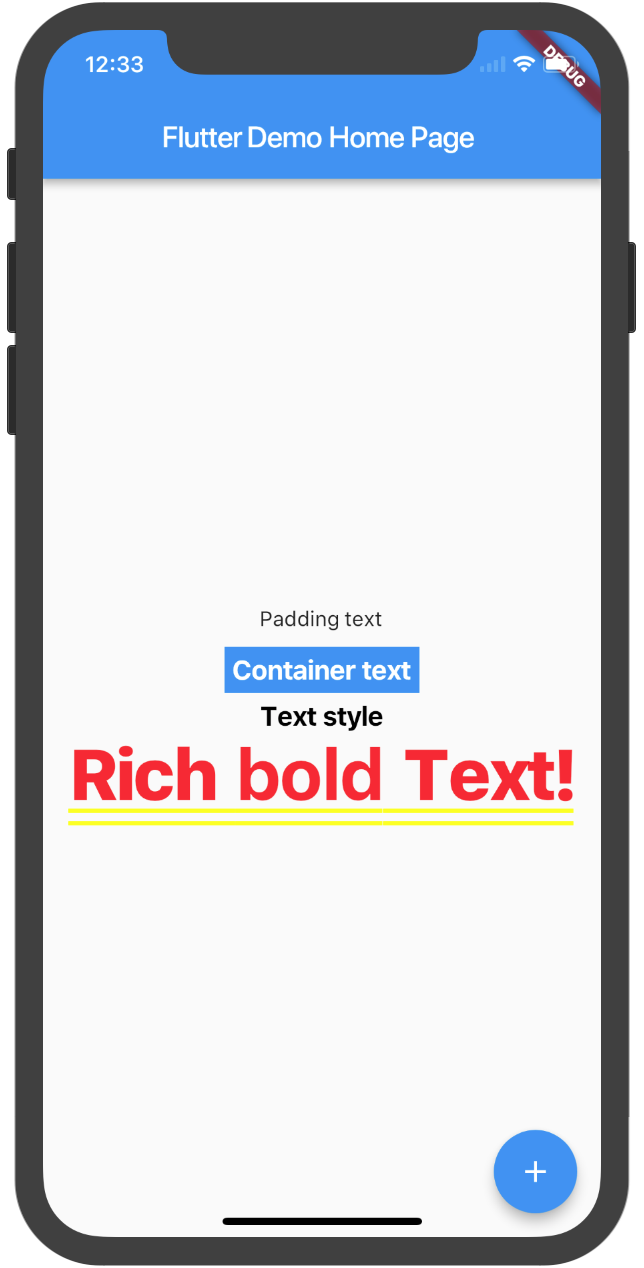
显示单行文本
 new Text('Text style',
   textAlign: TextAlign.center,
   style: new TextStyle(
        fontSize: 12.0,
        fontWeight: FontWeight.bold,
        color: Colors.black,),
    overflow: TextOverflow.ellipsis,
            ),
其中textAlign是用来控制文本对齐方式,style控制文本包括字体,颜色,字体大小等样式。
Text文本是没有边距的设置参数,我们使用Container、Padding与Text嵌套使用。
Container
new Container( child: new Text("Container text"),
              color: Colors.blue,
              margin: const EdgeInsets.all(5.0),
              padding: const EdgeInsets.all(5.0),),
容器Container是一个常用的控件,由基本的绘制、位置和大小控件组成。负责创建矩形的可视元素,可以用BoxDecoration来设计样式,比如背景、边框和阴影,Container也有边距、填充和大小限制等。
Padding
new Padding(child: new Text("Padding text"),
              padding: const EdgeInsets.all(5.0),),
如果只是设置文本的边距就可以使用Padding控件来实现效果。
如果想让文本控件响应Touch事件,要把该控件放在GestureDetector控件里使用。
在我们的开发中,Row、Column与Text使用,会被遮挡,提示如下警告:
A RenderFlex overflowed by 29 pixels on the bottom ...
不管你设置多行,还是别的还是会只显示一行。这里我们要使用Expanded控件包装每个控件。
Expanded组件可以使Row、Column、Flex等子组件在其主轴方向上展开并填充可用空间(例如,Row在水平方向,Column在垂直方向)。如果多个子组件展开,可用空间会被其flex factor(表示扩展的速度、比例)分割。
显示富文本
使用RichText 可以显示丰富样式的文本。
new RichText(
  text: new TextSpan(
    text: 'Rich ',
    style: DefaultTextStyle.of(context).style,
    children: <TextSpan>[
      new TextSpan(text: 'bold', style: new TextStyle(fontWeight: FontWeight.bold)),
      new TextSpan(text: ' Text!'),
    ],
  ),
)
最后的效果如下:
 BudgetVM优惠码
  Erchoc
  苟保罗
苟保罗  纯野
纯野  网上购买书架
  jack
jack  九道食品
九道食品  千刀乐
千刀乐
最新评论
朋友 交换链接吗
我也要评论,东华理工
很强
你是老师啊?
写的这都是什么语言啊,看不懂呢
包子还是一个有为青年。
关于旅行,总有许多幸福和迷恋。初秋浪漫而至,期待自己的下一站快乐。
楼主你好,我最近也在研究安卓无线点餐,不知您的源码能否分享一下,提供一些思路,谢谢:)
嗯嗯,原来我以前的姿势都不对的啊
对不起,我也没搞清楚,是想下载别人的模板,都是在网上看到的,人家的“空间或者服务器主机,的文件地址咱们也不知道呀,怎么填写读入目录呀。 这样的话,根本是下不了别人网站上的模板吧。 请教详细的下载方法。最好是人家在线的网站